Collector News
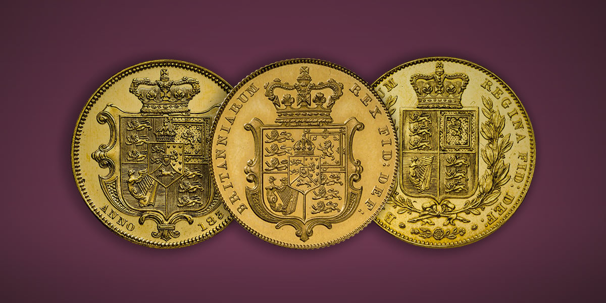
Two Hundred Years of the Crowned Shield
4th November 2024
As we mark 200 years since Jean Baptiste Merlen’s Royal Arms first graced our flagship coin.
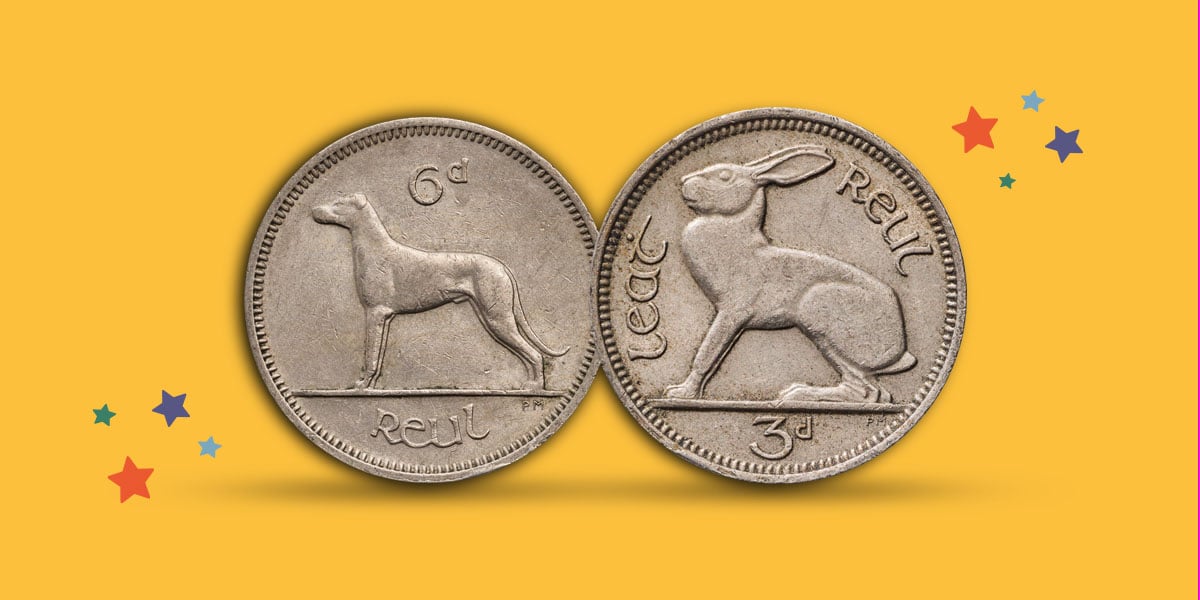
Animals on Coins
27th August 2024
Our Animals on Coins Collection is a fun and accessible way to discover the joy of collecting.
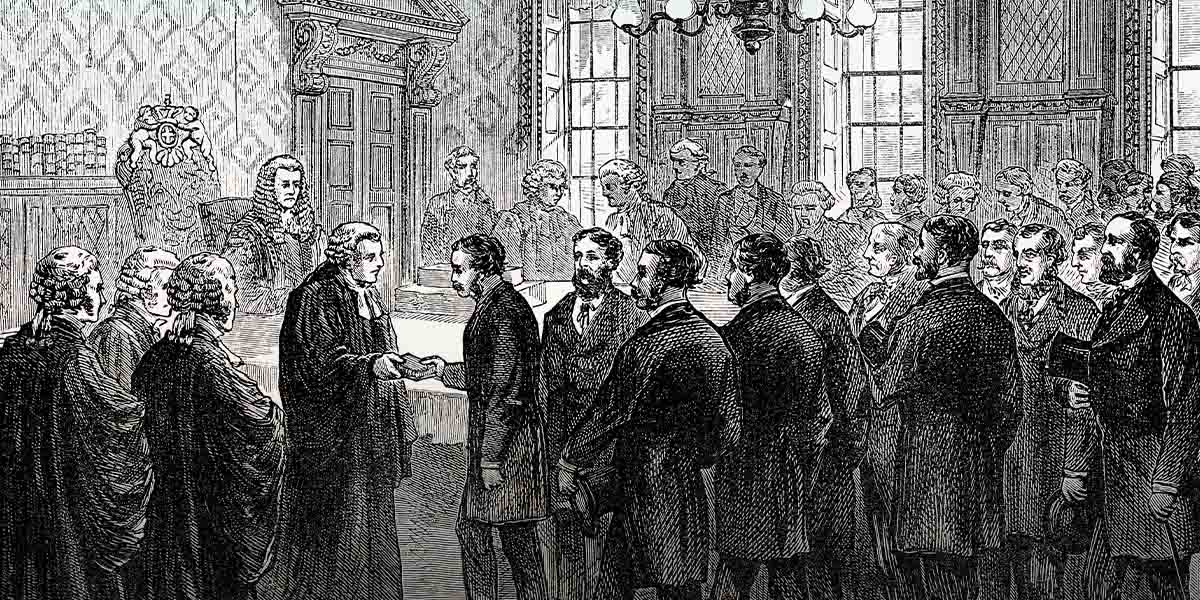
Trial of the Pyx
25th July 2024
Established more than 700 years ago, the Trial of the Pyx is one of the oldest judicial procedures that still exists today and is an integral part of everything The Royal Mint does.
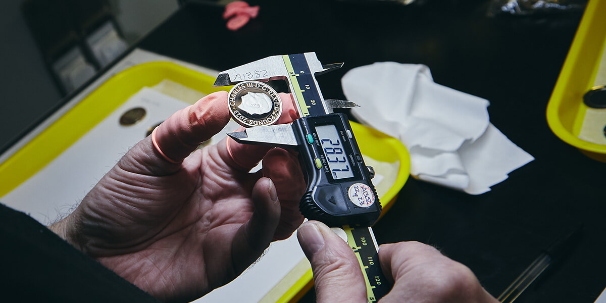
What is a Die Trial Piece?
16th January 2024
A die trial piece is a coin-like piece that we produce when we are developing new coins and techniques at The Royal Mint.
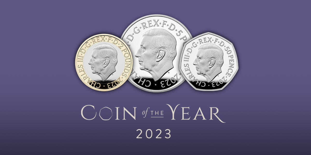
Coin of the Year 2023
19th December 2023
The Results Are in, Did Your Favourite Coin win the Vote?

Rare Coins
8th November 2023
The Royal Mint has been creating coins since AD 886 some of these coins could possibly be rare and might be very valuable.
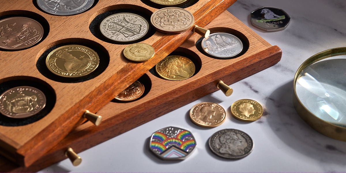
Uncover the Stories Behind Your Collections
7th September 2023
Each coin comes with a story, steeped in the history of how it was made and why that theme became commemorated on coinage.
Discover the Joy of Collecting
7th September 2023
Whatever your interest, we can help you commemorate your passions through fascinating coin collections and discover your next greatest find.
Guide to getting a fair price for a coin
7th September 2023
If you have a coin and are unsure about its history, rarity or authenticity we offer a range of services at The Royal Mint.
The Rarest UK £2 Coins
21st August 2023
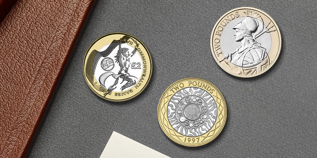
In this article, we will explore the history behind the coin and discover the nine rarest £2 coins to be produced by The Royal Mint.
The Rarest 50p Coins
17th April 2023
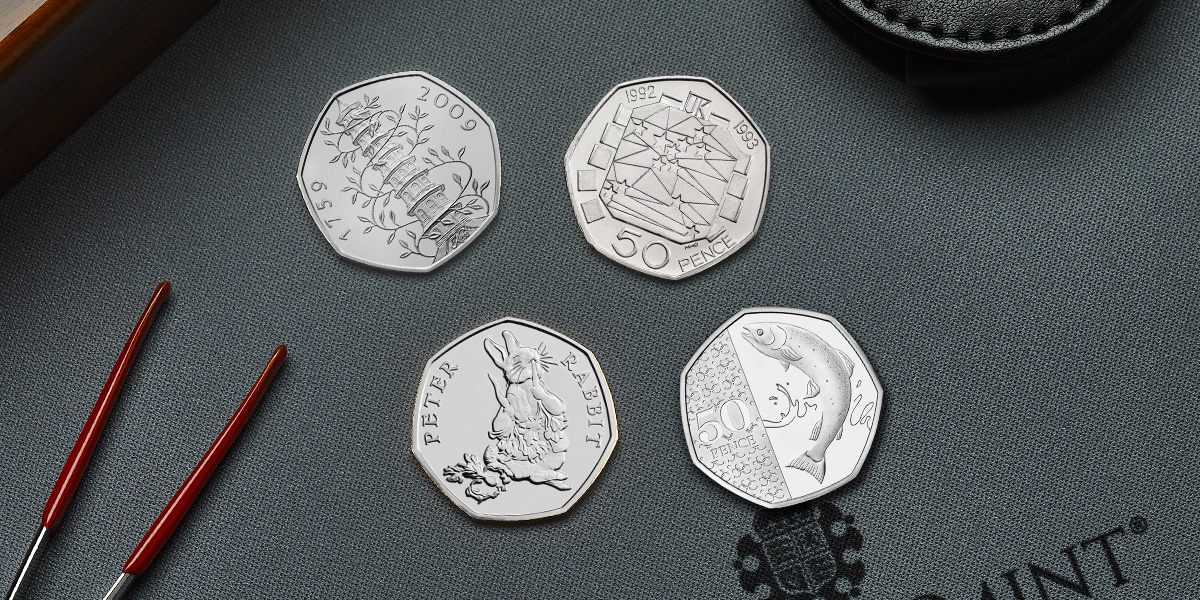
A select few of these superb coins have become some of the rarest 50p coins ever struck by The Royal Mint.
Coin Names and Nicknames
10th August 2020
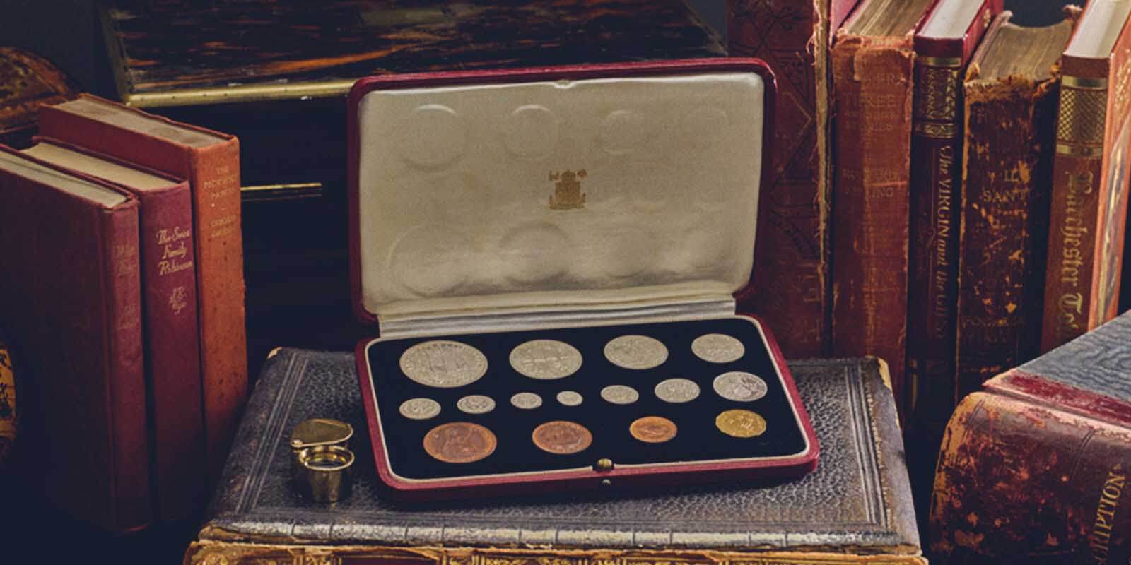
We present to you a selection of our best attempts at referencing and researching the murky history of coin nicknames.

Maundy Money
16th January 2020
The first Maundy money ceremony took place in the reign of Charles II, when the king gave people undated hammered coins in 1662.

The Undated 20p Coin
14th August 2018
In November 2008 a number of 20p coins were incorrectly minted, resulting in the coins being undated.

The Piedfort Coin
12th February 2025
Since 1982, The Royal Mint has produced extremely limited numbers of Piedforts in sterling silver to Proof quality.

The UK Coins That Were Never Made
31st October 2017
Britain adopted decimal currency in 1971 but the process of designing the new coins actually began ten years earlier.

Making The Change To Decimal Coinage
11th October 2017
The changeover to decimal currency was no small task: the public and businesses of Britain required all the necessary information to make the changeover as smooth as possible.

Christopher Ironside’s Designs
11th October 2017
Britain’s first decimal coins were designed by the sculptor Christopher Ironside FSIA FRBS OBE. We asked his widow, Jean, what it was like to live through that momentous time.
A New Design For The Nation’s Coins
11th October 2017
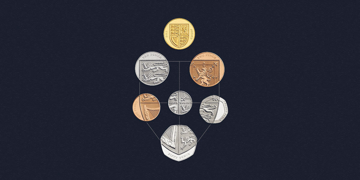
The first decimal coins that appeared in the United Kingdom back in 1968. 40 years later, in 2008, we wanted to update the coins with a fresh set of designs.
The Decimal Debate
10th October 2017
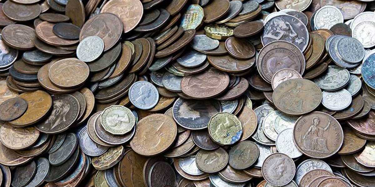
Decimalisation had been the subject of passionate debate for centuries. As early as the sixteenth century, mathematicians and others had seen the advantages of a decimal system.
Making The Coins In Your Pocket
9th July 2017
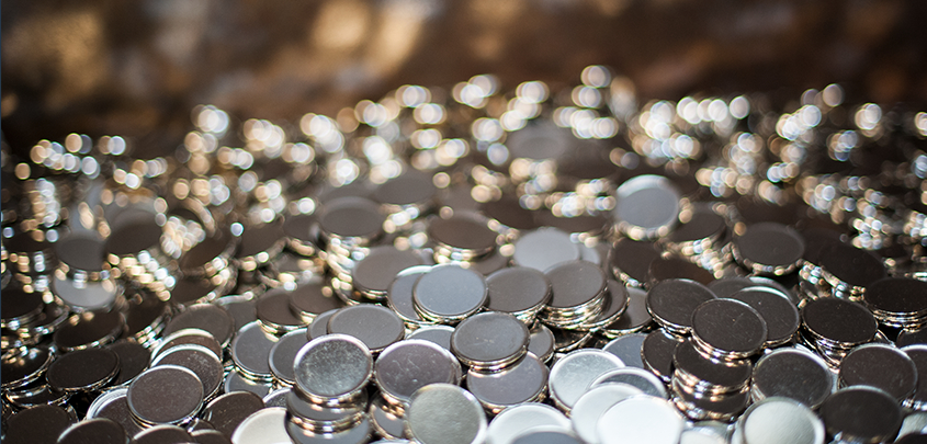
There’s a lot more goes into making the coins we all use every day than you might think.
Don't miss our latest updates...
Be the first to know about new product launches, limited editions, rare coins and much more...
